
Carpe Diem: Process


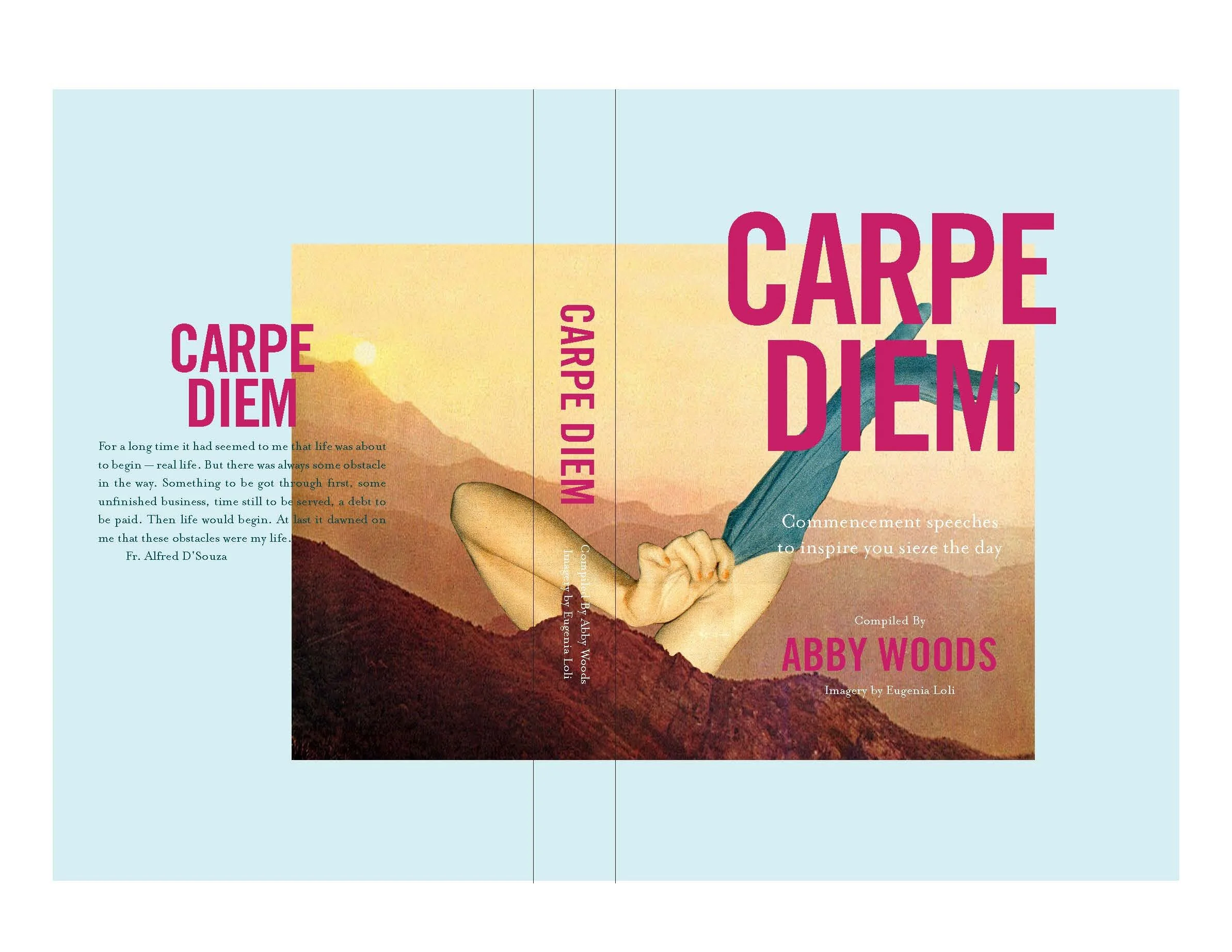
OBJECTIVE: The objective of this brief was to take a previously published book and redesign the publication, with the goal of improving the original design.
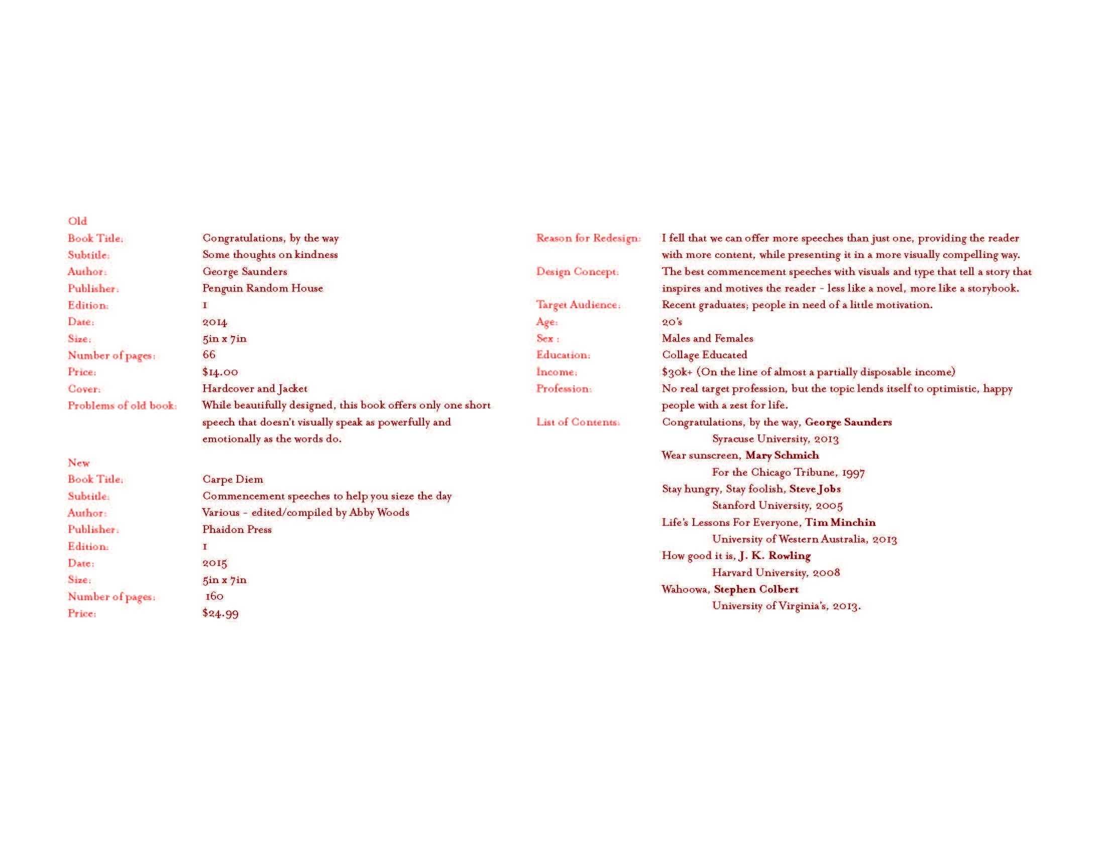
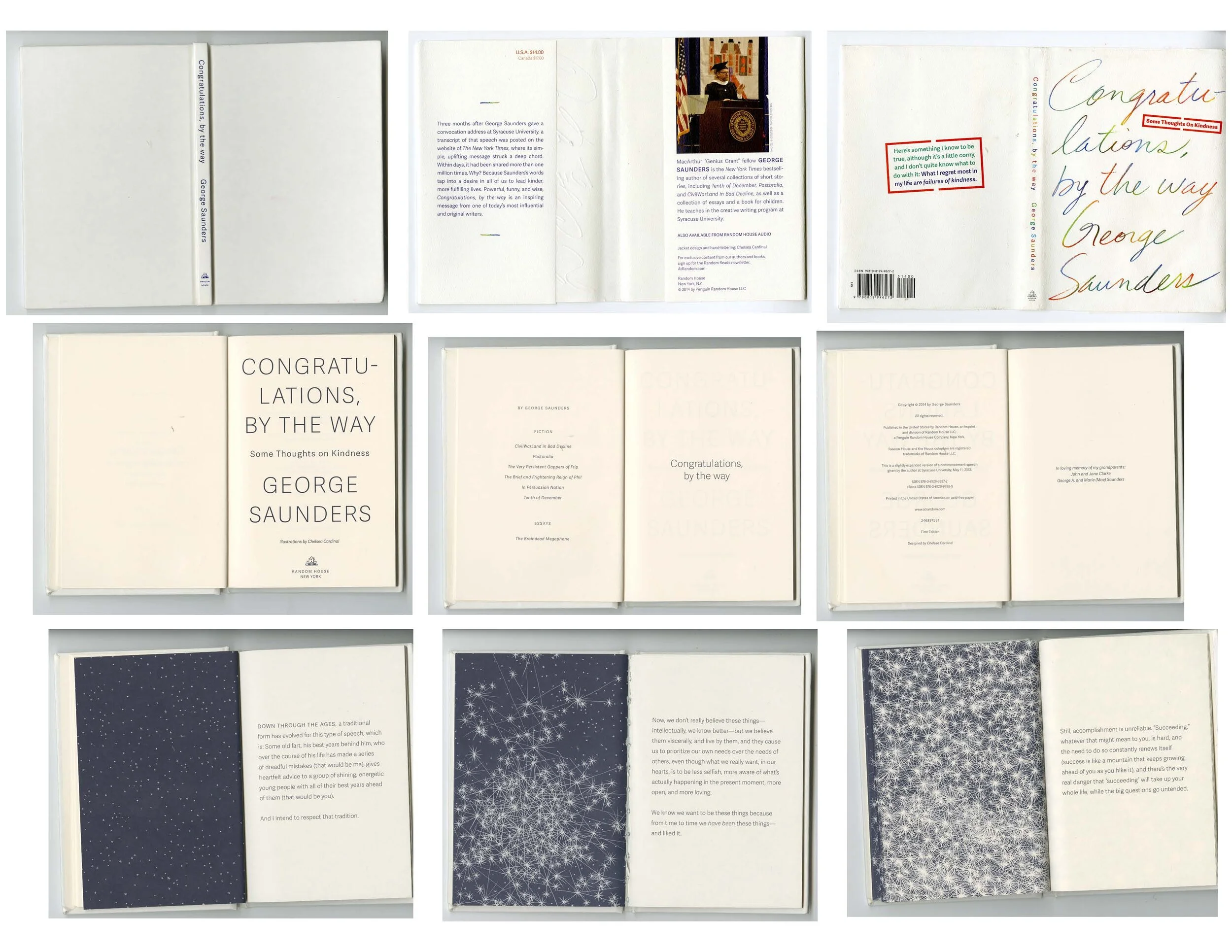
PROCESS: This project started with examining the original book – Congratulations, By The Way by George Saunders – and finding where there was space to improve on the initial design. I found that space by adding more written content, changing it from a short book featuring only one speech, to a slightly more fleshed out illustrated book with more speeches for the reader. This meant that the book was still quite a quick read, but had more opportunity for a quirky and fun design.
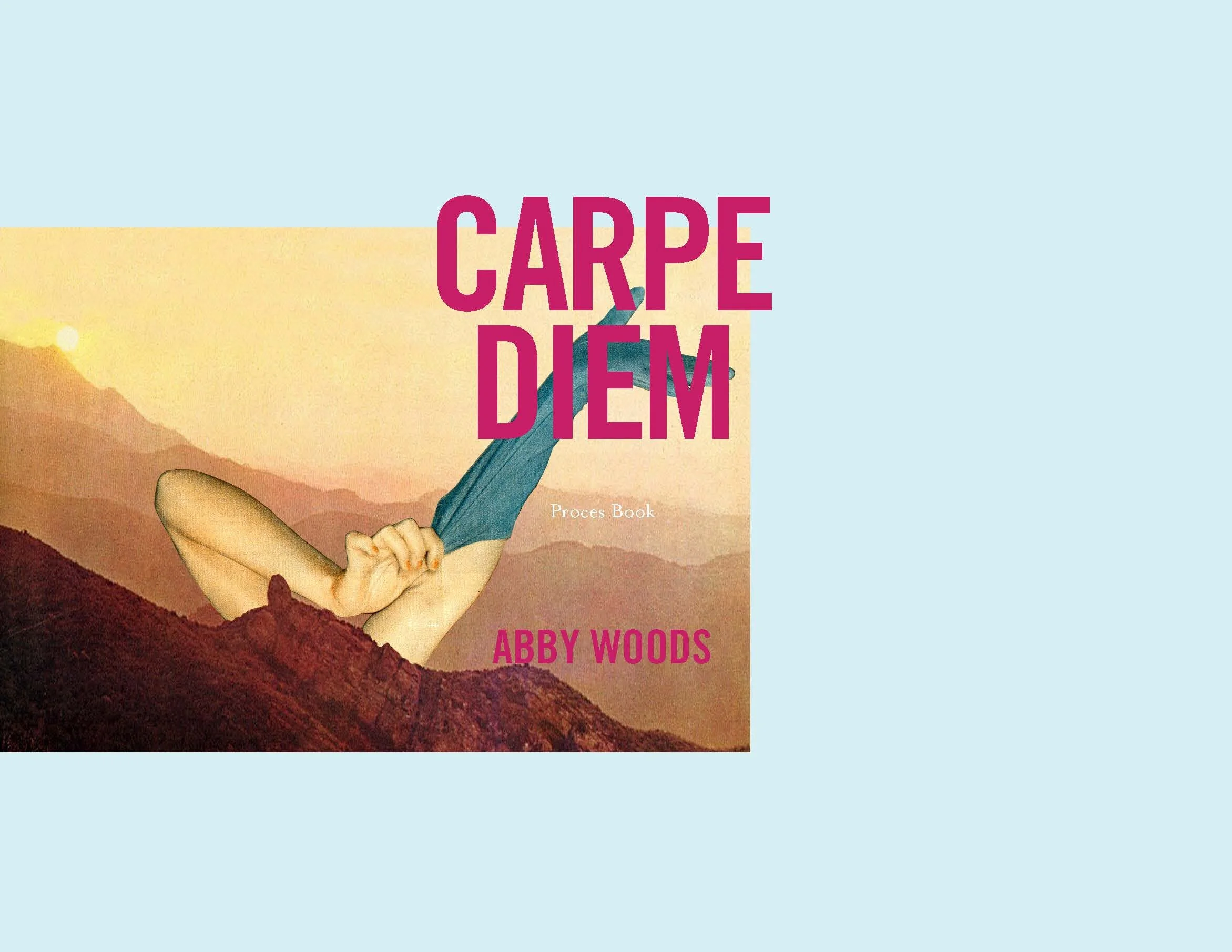
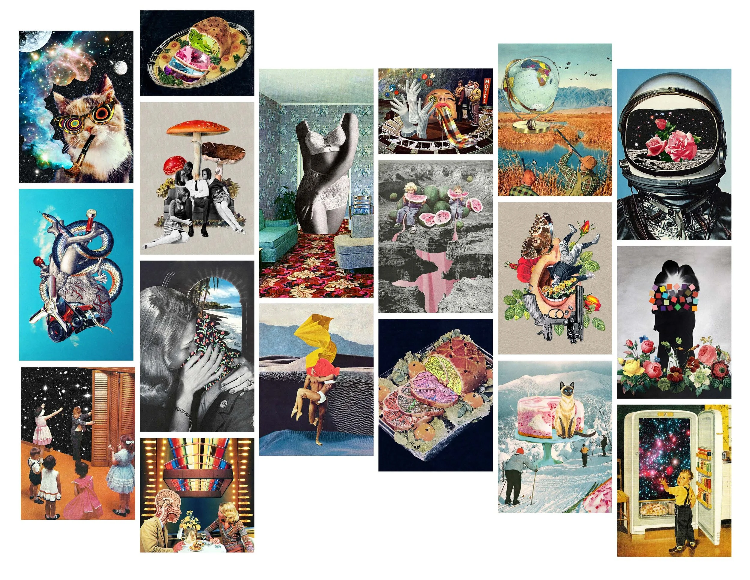
DESIGN SOLUTION: The final design solution was of a proposed publication featuring six commencement speeches from around the world, expanding on the initial book that only had one speech. The final design is whimsical and bright, featuring collages created by Eugenia Loli, intended to inspire young graduates.
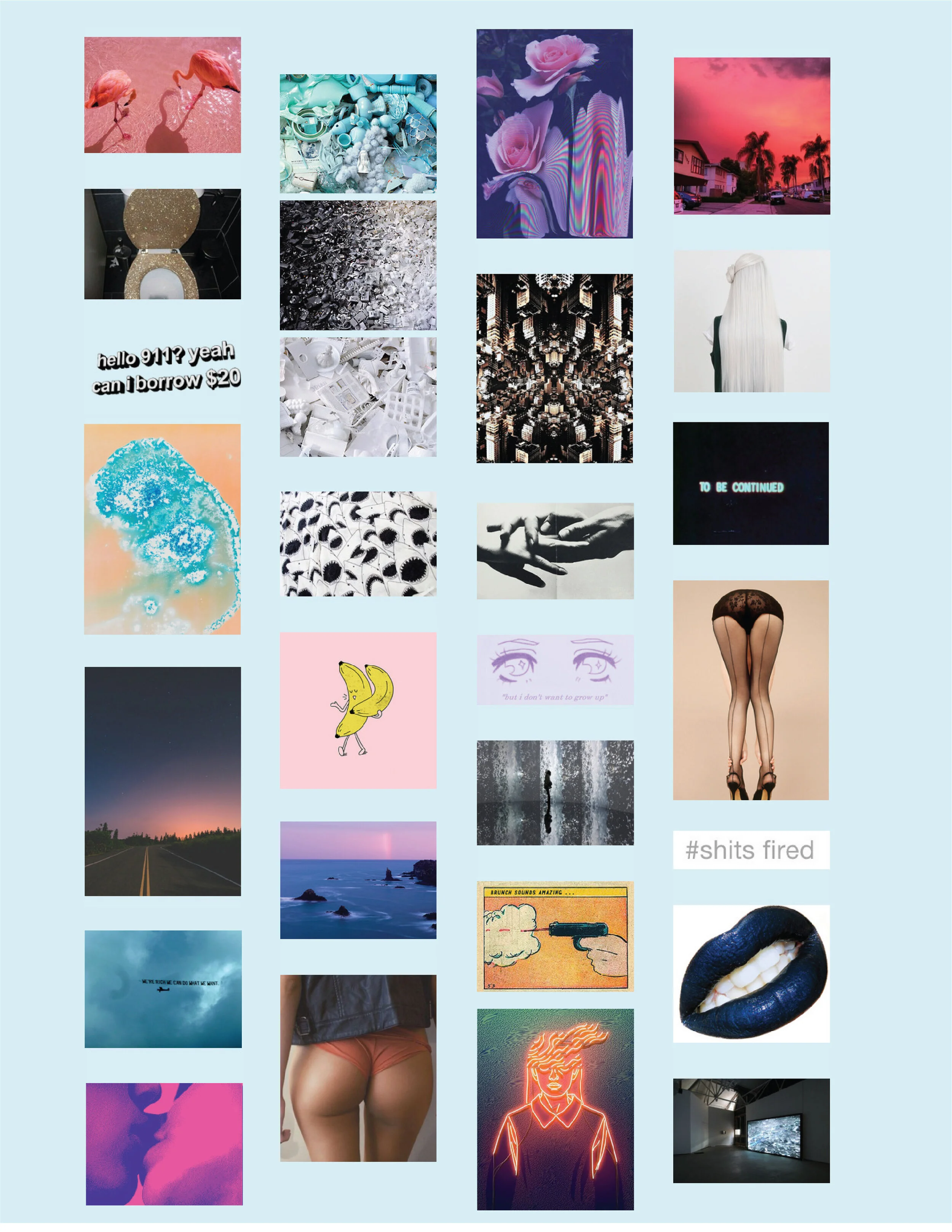
SCRAG: Process
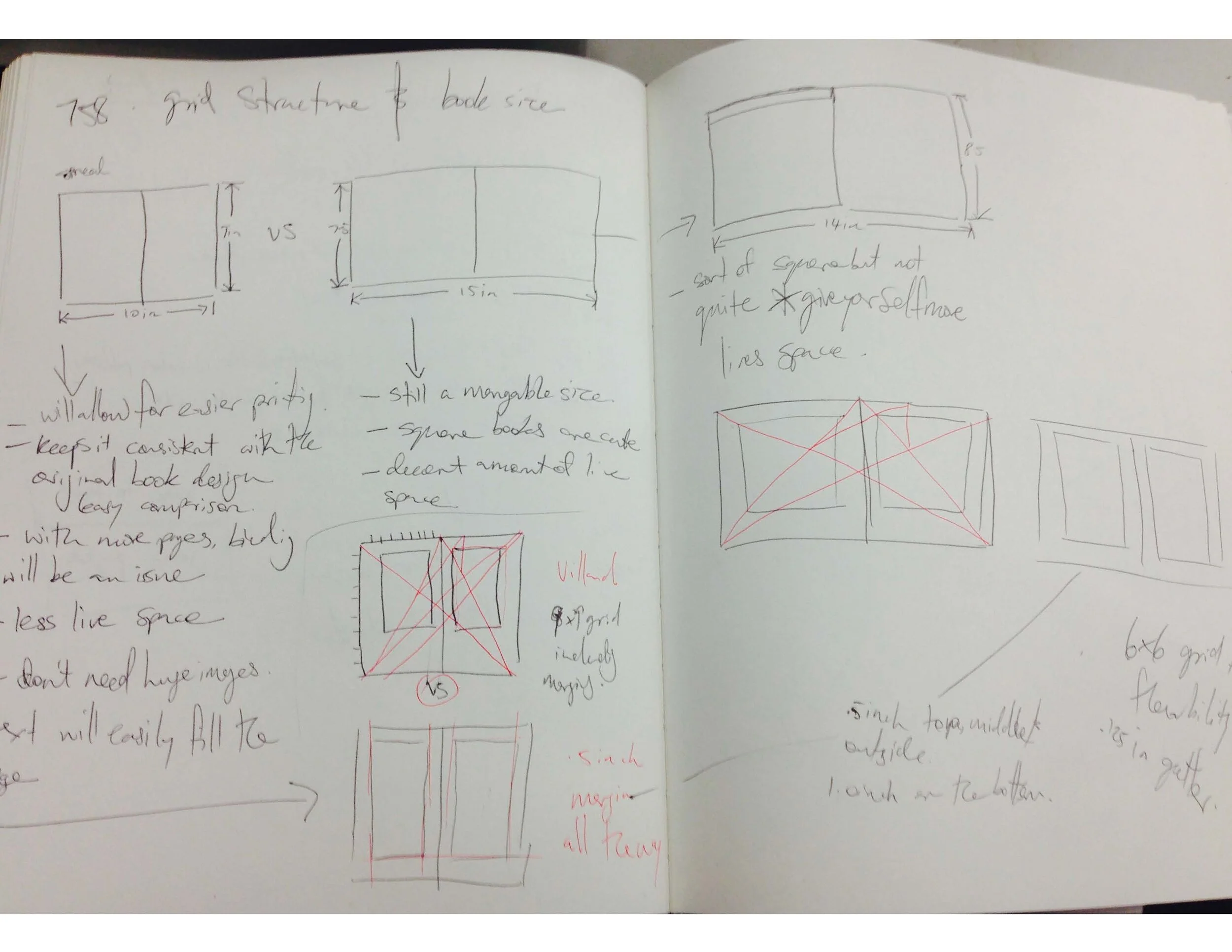
OBJECTIVE: The objective of this project was to develop and hone strong, innovative publication design skills. The objective of the final outcome was to create a magazine publication that speaks to a target audience – identified as fun and outrageous – while still adhering to strict publication design rules.
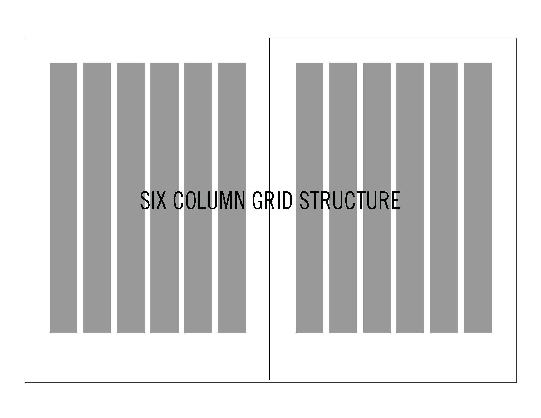
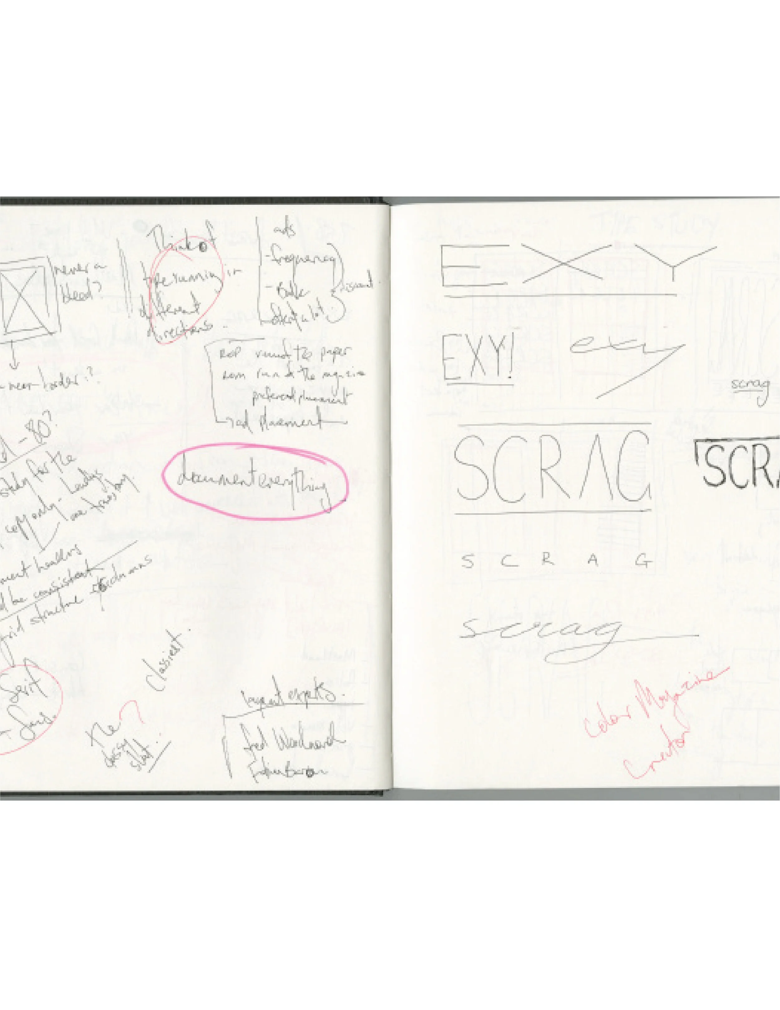
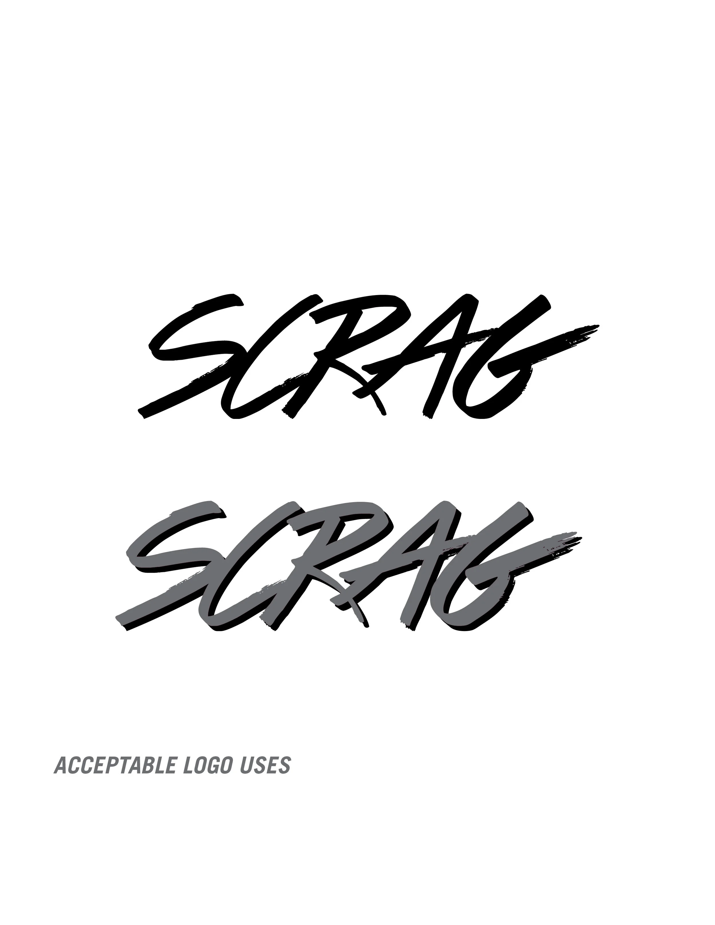
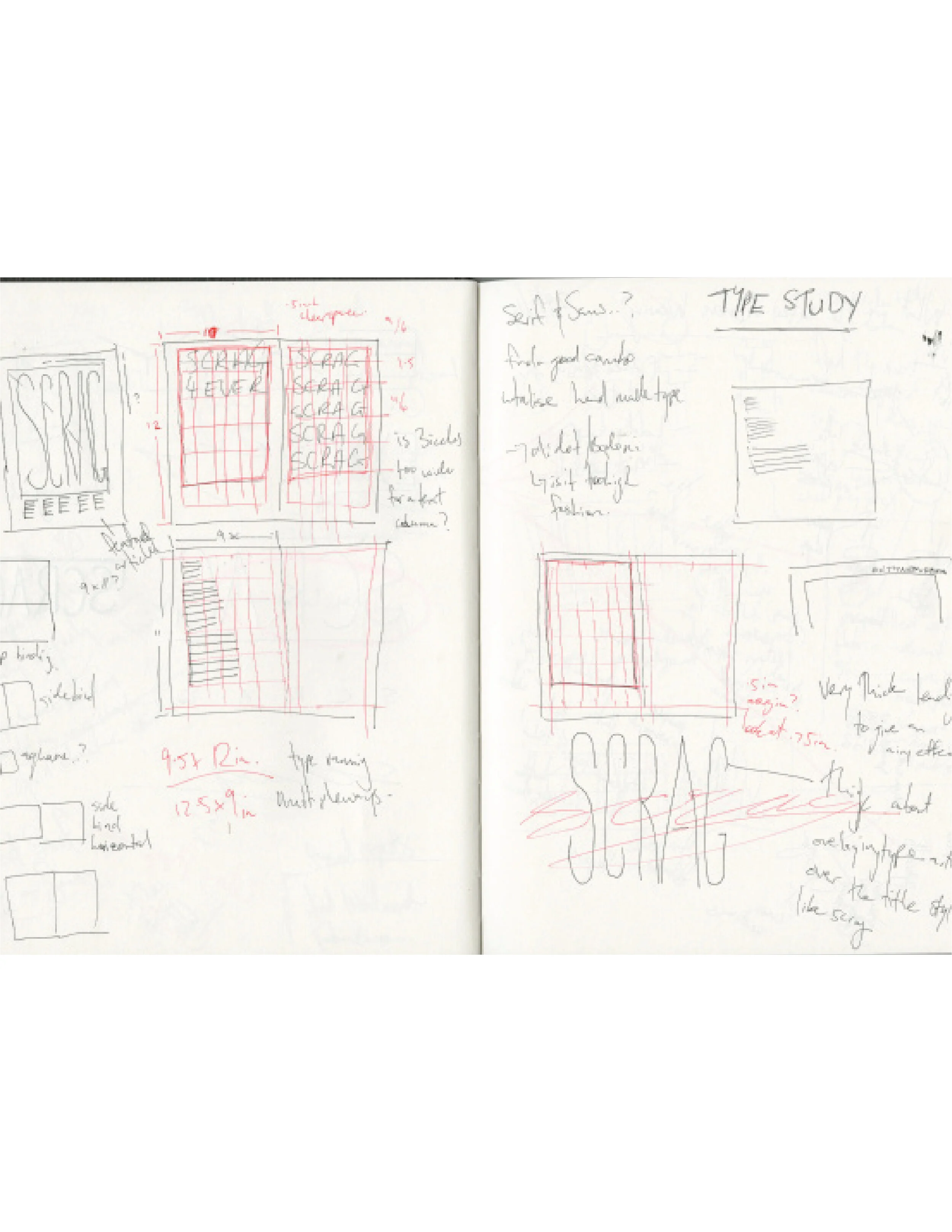
PROCESS: This project started with research on current magazines to find a space for a new publication. I created a magazine that I would like to read – funny, inappropriate and fashionable but not glossy in the way that is currently trending. I designed the branding, visual narrative and departments to feel spacious but not empty, to set the magazine apart from what is currently available in publishing. Finally, I decided to name my magazine after an insult in Australia – “SCRAG” – to give the magazine a sense of empowerment.
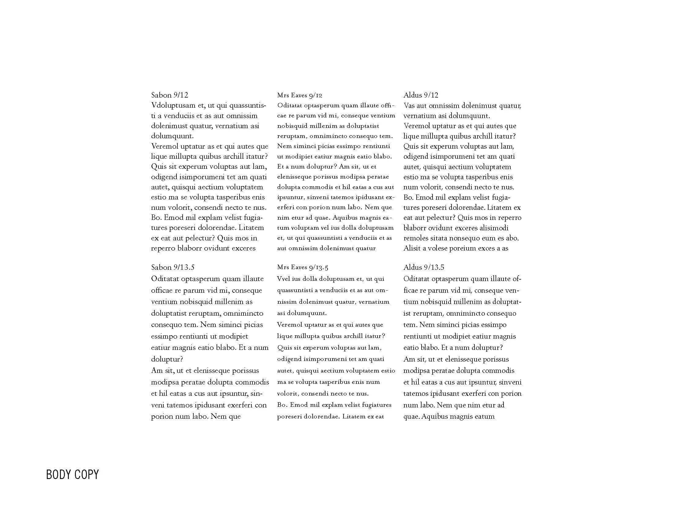
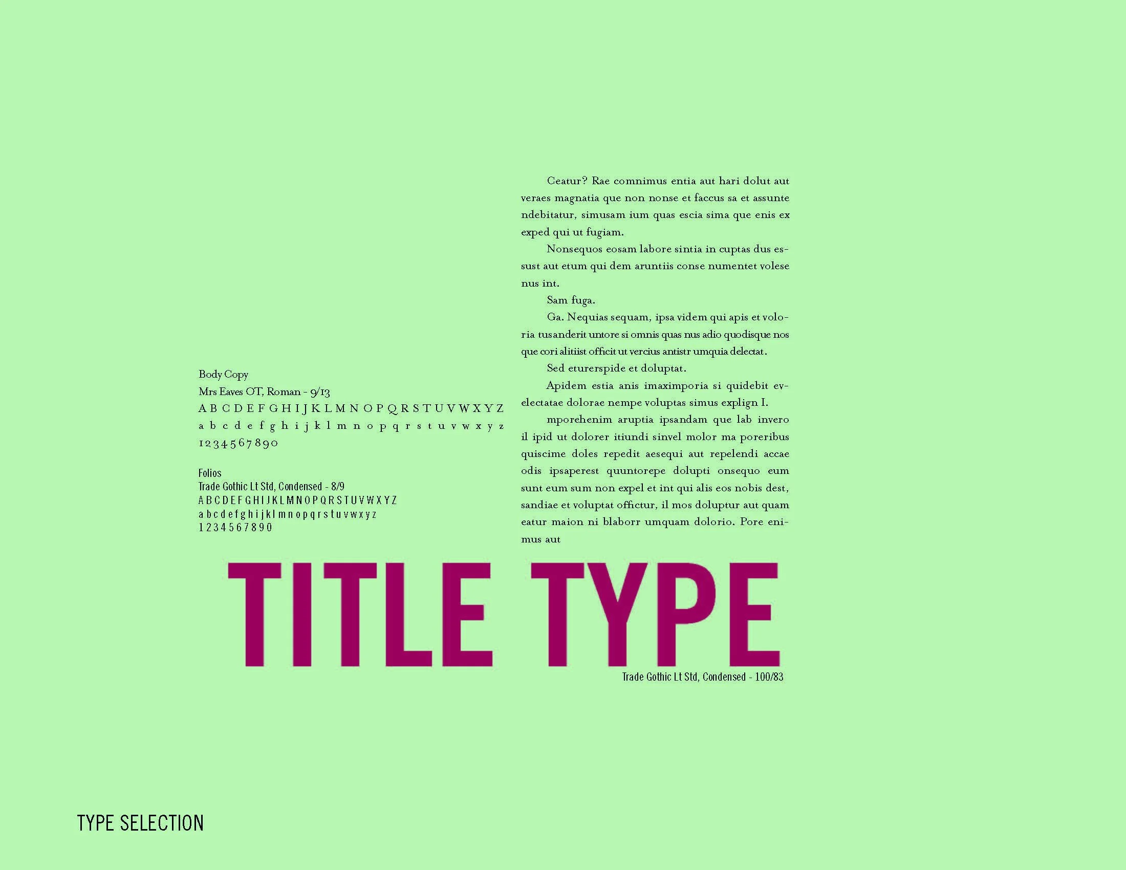
DESIGN SOLUTION: The final design solution was a medium format magazine printed on matte paper. The content and theme provided a humorous, crass departure form publications currently available while still looking clean and contemporary. After submission, I felt that the treatment of the department pages as well as the body copy type choices were a little forced and heavy handed, so I refined the design in those areas. I also went on to create an e-publication version of the magazine. This digital version maintained the humour and visual narrative that the printed version offered, but widened the market of people now able to access SCRAG.


Hot Pepper Property: Process


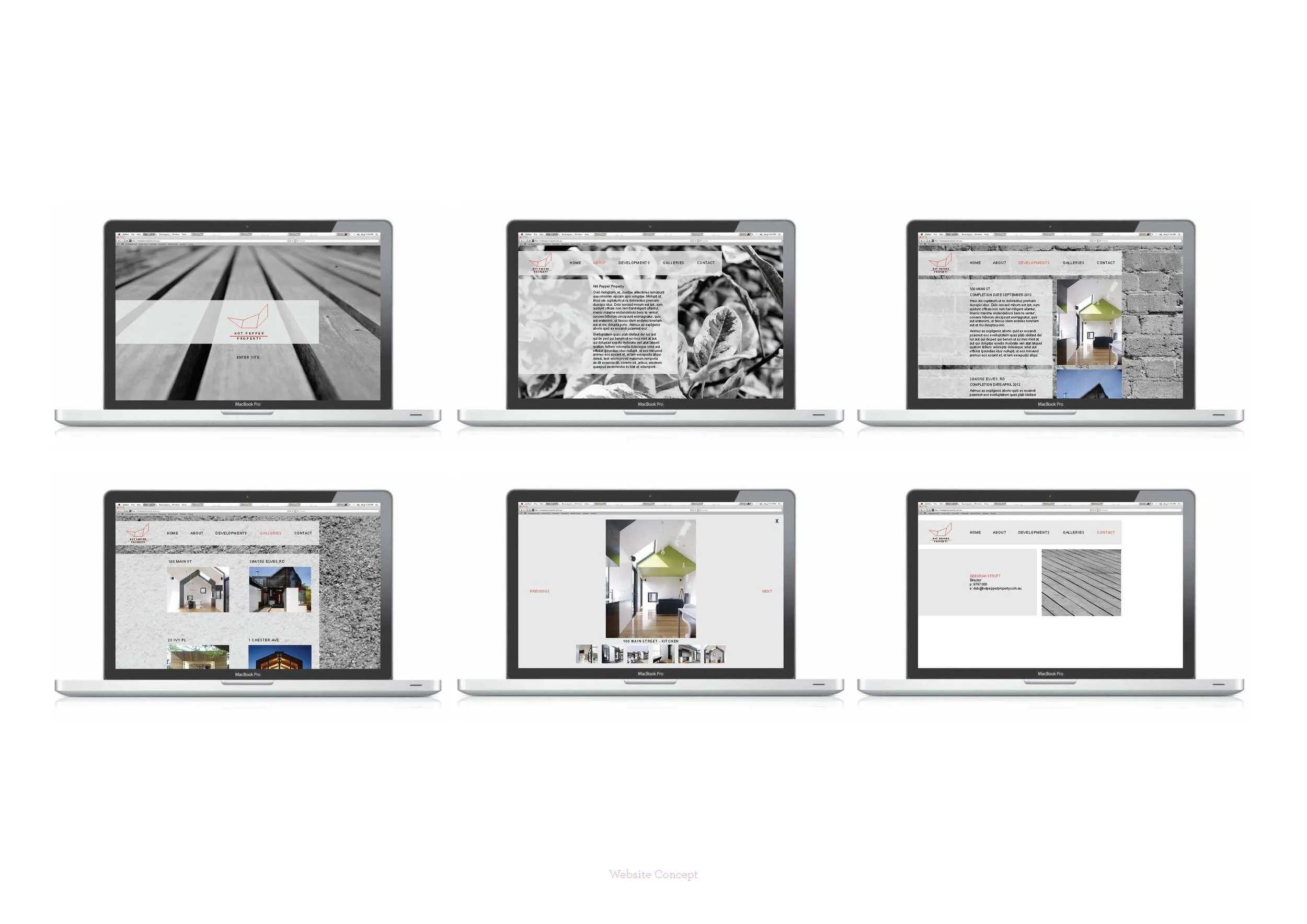


OBJECTIVE: The objective of this brief was to create an identity for a new property development company that strives to be environmentally aware and sustainable.
PROCESS: I was tasked to create a logo, website and stationery set that encapsulates the company's environmental awareness, with a strong brand personality that channels the Directors individuality. Factoring the nature of the company, as well as its mission statement, I created a logo that was born from housing plans, land subdivisions and subtly referenced a chilli.
DESIGN SOLUTION: The final design solution centres the feel of the brand on textures that can be found in homes and in nature, a show of environmental awareness that is both intelligent and unique.